
Vince, or Vinnie Colletta was one of the most controversial, perhaps
the most controversial inkers in comics. If not controversial, polarizing. He worked with Jack Kirby for a huge chunk of time, primarily on his run on Thor. I've been rereading these Thor stories again and they're just incredible. The imagination, the artwork and experimentation is just awe-inspiring. Jack Kirby was simply a gifted genius. However, many claim that Colletta "ruined" his art.
Neal Adams called him the worst inker ever. Steve Ditko said he used to check the roster on the new issues and if he saw Colletta's name he would make a point of throwing it aside or even tossing it in the trash. Many other artists were pretty vocal about disliking his style or his work. This was due to his quick speed (he inked Kirby, remember?) to which he would simplify background characters or silhouette them to make deadlines.
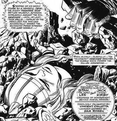
Erasing "King" Kirby? This sounds like treason... how could you erase the master!!!?!??! I think all the complaints about him are a little ridiculous. First of all, he is an amazing inker. Period. He had a delicate style that gave the characters a feeling of weightlessness, yet without making them feel insubstantial. This is perfectly suited to the world of Jack Kirby, where everyone flies and floats around with logically indefinable yet stylistically impeccable costumes, where monsters crush and hammers fly. According to Mark Evanier, Kirby thought he did shoddy work, but growing up as a depression-era kid, didn't really feel like taking someone's job. Jack Kirby was too nice to say he didn't like his work.
But if you've drawn something and it gets taken out, you probably aren't going to be happy, whether it's the editor, the inker, or the market. Creative people are fragile. This is a fact that tends to get overlooked in the brutal world of comics, even, and especially when people act like jerks.
A lot of what people think of when they think of "The Kirby Style" is owed to Colletta. You can't take anything away from Kirby's genius, but when people ape his style, it is often in the inking style that they focus on to give it "that look." A lot of this is lost from abysmal reproductions (many of the originals are gone forever?) but flip through one of the Thor books (hopefully not reprinted) and find a page that looks like the printer didn't smear extra ink on it and you will see some of the delicate, beautiful lines that translated Kirby's world to us unsuspecting humans.
A lot of what went on between him and other artists may seem like ego or infallibility. Kirby is rightly treated as a god amongst mortals, but look at this panel. Colletta erased Mr. Fantastic. Stylistically this makes sense to me. Maybe I'm alone in my opinion, yet I think compositionally this panel works better without the other figure! Whether this was laziness, arrogance, inspiration or editorial, the fact remains that
it works for me. But don't take my word for it! Click on the panel to enlarge:

Look at Superman's (EX-)Pal Jimmy Olsen issue 143's double page spread of The Mountain of Judgement or two-page photo-collage experiment where Jimmy drives his car through a psychadelic "nightmare." This is what makes comics fun and shows why they had so much more energy than today's lifeless automatons. Comics today are poorly drawn. A good inker can fix up the mistakes. Is obliterating whole characters more of a sacrilege than fixing a nose? It's audacious, yes, but what defines the line between inking and enhancing and inking and ruining?
For some reason Klaus Janson is the guy that wrote the book on comics inking. I would love if someone could explain why.
Mike Royer (also incredible) had inked a few covers for Kirby while at DC. Wally Wood and Mark Evanier eventually convinced Kirby to ditch Colletta for Mike Royer. Fans wrote in wondering why Kirby had abandoned the "Marvel style." Well kids, the "Marvel style"
was Kirby's style. That just shows how influential he was to the look of Kirby's world. And the number of books he did attests to his skill and speed. Why would they ask for the Marvel style back after switching inkers if the Marvel style was Kirby's style? This is a repeated event with many of the artists that malign Colletta. He ruined their art, they get somebody else to ink it and then sales slump.
Criticized for simplifying details and giving a huge, bold bombastic look to the art... personally I think it's the perfect style, and tellingly the style that is most used when making comics look "retro" or trying to capture that silver age feel. All the detail in comics now looks like garbage. Add to this the bland computer inking and eyesore photoshop palette and this was the beginning of the end. The seventies would lead to a sketchier, drearier stoicism that shied away from the dark joys of Alex Toth and Steve Ditko. Interstingly enough, these would be siphoned off by Hanna-Barbera, no stranger to stylistic shifts, who would churn out stiff cartoons themselves with progressively poorer and poorer art.
But that's a whole 'nother tale.
Lastly, I'd like to present to you the infamous "Vince Colletta letter" (Colletter?) that's been making its rounds. In 1987, Jim Shooter was fired from Marvel. He followed a rearrangement of overseers while Stan Lee went all Hollywood on Marvel's ass and never looked back. Jim Shooter whipped the bull-pen into shape, making missed deadlines a thing of the past and overseeing Miller's Daredevil run, Claremont and Burns' Uncanny X-Men, Bill Sienkiewicz and a a ton of other artists and a slew of titles picking up sales. His clashes with artists would become fatal however, leading to pretty much all the top talent jumping ship: Gene Colan, Steve Gerber, Marv Wolfman, George Perez, Mike Ploog and John Byrne. Jim Shooter was also one of the few non-artists instrumental in getting artists rights to their characters and creative royalties, which should be his most important legacy. Steve Gerber was the one that finally did it, although he was fighting 'til the end to get credit he never recieved.
To show you how tense and shitty it was around the Marvel office; in issue 127 of The Invincible Iron Man, Dave Cockrum's (another ship jumper's) resignation letter was placed in a panel, replacing "Marvel" with "Avengers" and passed off as Tony Stark's butler's resignation for a previous alcoholic berating. Here's the text:
To: Anthony Stark
This is to notify you that I am tendering my resignation from my position. This resignation is to take effect immediately.
I am leaving because this is no longer the team-spirited "one big happy family" I once loved working for. Over the past year or so I have watched Avengers' morale disintegrate to the point that, rather than being a team or a family, it is now a large collection of unhappy individuals simmering in their own personal stew of repressed anger, resentment and frustration. I have seen a lot of my friends silently enduring unfair, malicious or vindictive treatment.
My personal grievances are relatively slight by comparison to some, but I don't intend to silently endure. I've watched the Avengers be disbanded, uprooted and shuffled around. I've become firmly convinced that this was done with the idea of 'showing the hired help who's Boss.'
I don't intend to wait around to see what's next.
Sincerely,
(Jarvis)
cc: The Avengers
They issued a swift apology, but why point out you're airing your dirty laundry?

Vince Colletta's letter to Marvel on Shooter's firing didn't surface for a long time. Now that it has, he's become controversial for more than his inking. It makes sense that Colletta would find Shooter's firing so reprehensible; here was a guy that worked his ass off and expected everyone to do the same. Here was someone that, like Colletta, was being punished for hard work, getting fired for making deadlines instead of friends.
I don't personally know what went down at Marvel, but I sympathize with Colletta's anger and frustration. Yes, he was losing his work there as well due to Shooter's loss, so his frustration is not entirely altruistic. He may have been a dick to work with, he may have be a terrible inker in your eyes, but in the end his work amazes and inspires me. At the end of the day, that's all I can ask from comics.
Oh yeah, speaking of airing dirty laundry, here's the letter:
Marvel Editors... you are the droppings of the creative world. You were destined to float in the cesspool till urine logged and finally sink to the bottom with the rest of the shit but along came Jim Shooter who rolled up his sleeves and rescued you.
He gave you a title, respectability, power and even a credit card that you used and abused. He made you the highest payed Editors in the history of the business. He protected you against all that would tamper with your rights, your power and your pocketbook.
He backed you against all Prima Donna free lancers no matter how big...his pockets were always open to you. No cry of help was too small for him to turn his back on.
As heard in the "Brass" section of the company..."He never asked for anything for himself...always for his men."
The roof over your head, the clothes on your back, the car you drive and the trinkets you buy for your blind wives and girlfriends you owe to the Pittsburg kid.
For all he did for you... you repayed him by attacking him like a pack of yellow, prickless faggots. Ripping away his flesh from his body and laughing and pounding your chest like conquering ghouls and long after his bones were dry you continued to pour salt on them to squeeze every ounce of pain out of him.
Not the slightest whimper or cry or tear came out of this man. With you still biting at his ankles, he put on his coat and walked away... Displaying more class and poise in defeat than all of you did in victory... Jesus had one Judas... Jim had many, those that speared him and worse, those that watched...
I stuck by him and for that you've nailed me on the same cross... I thank you for that... It's an honor to be crucified with Jim Shooter...a man who none of you will ever be.
Vince Colletta
Before you judge, Marvel was at this time being bought by New World Entertainment. It's now owned by Disney. And all of their titles are terrible.
In the end, it feels like too many bruised egos have filled the halls of comics. Was Colletta a hack or a great inker? Was he a charming curmudgeon or the victim of malicious back-stabbing? The truth usually lies somewhere in-between. Until then, I'm basking in the beauty of Kirby's Thor (dialog by Stan Lee) with Inks by Vince Colletta. I love his work and I hope you do too!
EXHIBIT A:
For the brilliant Eddie Campbell's defense of Colleta, click here.(with tons of examples and scans and other fun stuff!)
EXHIBIT B:
Here's Mark Evanier's response to Campbell and take on Vinnie.




 del.icio.us